Introduction
to ArcGIS
Prepared by
Center for Research in Water Resources
University of Texas at Austin
September 2013
Table
of Contents
Goals
Computer and Data Requirements
Procedure
1. Viewing Shapefiles in ArcMap
2. Viewing Shapefiles in
ArcCatalog
3. Using Basemaps from ArcGIS
Online
4. Accessing and querying
attribute data
5. Selecting features from a
feature class
6. Mapping annual evaporation
7. Making a chart
8. Making a map layout
9. Mapping in ArcGIS Online
10. Adding Pan Evaporation Data
11. Configuring Pop-Ups
12. Adding Counties and Map Notes
13. Sharing the Map on the Web
Items to be turned in.
Goals
of the Exercise
This
exercise introduces you to ArcMap and ArcCatalog. You use these applications to
create a map of pan evaporation stations in
Computer
and Data Requirements
To
carry out this exercise, you need to have a computer, which runs ArcGIS Desktop
version 10.2. You will also need and ESRI Global Account to enable you to login
to ArcGIS Online. If you do not already have an ESRI Global Account, go to: https://www.arcgis.com/home/createaccount.html and create one.
In
the first part of this exercise using ArcGIS Desktop, you will be working with
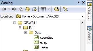
the following spatial datasets:
- A
polygon shapefile of the counties of
- A point shapefile of pan evaporation stations,
called Evap
- A polygon shapefile of the state of
These
shapefiles consist of several files (e.g. evap.dbf, evap.shp, evap.shx). You
can get them from this zip file: http://www.ce.utexas.edu/prof/maidment/giswr2013/Ex1/Ex1Data.zip
You need
to establish a working folder to do the exercise on. This can be in c:\temp,
your student directory, or on a memory stick attached to the machine you are
working on. If you don't yet have a regular Login account at the Civil
Engineering Learning Resource Center, get a temporary guest login to do the
exercise.
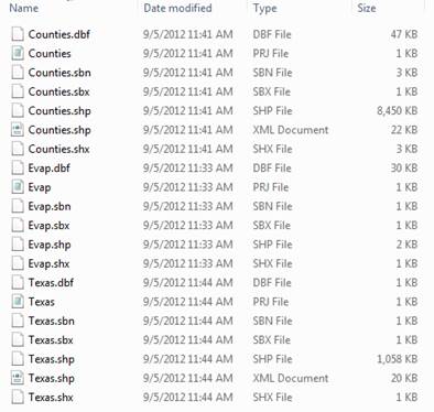
After
you have downloaded the zip file Ex1Data.zip
double click on the file and you should see the Winzip, Alladin Stuffit utility,
or other zip utility to open the file on your computer (if it doesn’t
open you’ll have to unzip this file on a computer that has a zip utility
installed). Extract all files from the zip file to the working folder that
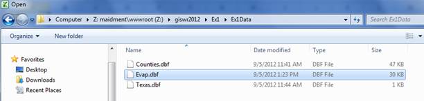
you’ve set up to do this exercise. You should end up with a file list
that looks something like this. You may see these data within a sequence of
folder names, and if so, click on each folder down through the sequence until
you locate the required files.
Procedure
Please
note that the following procedure is a general outline, which can be followed
to complete this lesson. However, you are encouraged to experiment with the
program and to be creative.
1. Viewing Shapefiles in ArcMap
A
shapefile is a homogenous collection of simple features that do not
contain topological information. A shapefile includes geometric features and
their attributes. The attributes are contained in a dBase table, which allows
for the joining with a feature based on the attribute key.
Open ArcMap and select the A new empty map option. If you are using Windows 7 or Windows XP, hit
the Start button and you’ll see a series of options for ArcGIS. Select ArcMap.
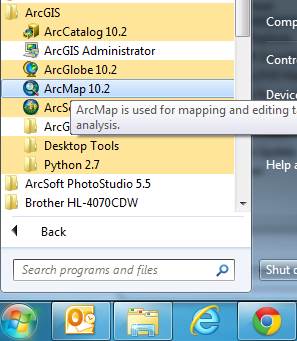
If you are using Windows
8, you’ll see  in your Windows display. If you don’t see that, then just type
“ArcMap..” and you’ll see the program symbol appear.
in your Windows display. If you don’t see that, then just type
“ArcMap..” and you’ll see the program symbol appear.
Use the Add Data button to add the data for
this exercise to the ArcMap display.
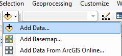
Navigate to the folder,
which contains the data, and select all three files at once by using the shift
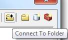
key. Click the Add button to import the data. If you are using a network drive
to obtain your files use the Connect to
folder button to add the network drive to the ones that ArcMap is accessing
so you can get to the files.
Click on each of the
three shape files so that they are highlighted
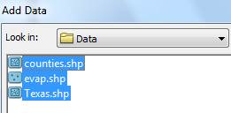
and add them to your
ArcMap display.
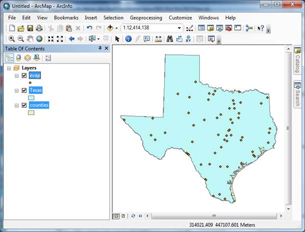
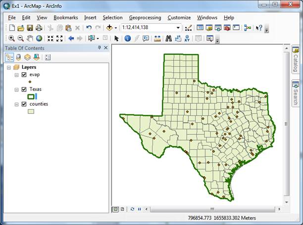
All the themes are
highlighted and Texas lies above counties so you cannot see the counties theme.
Click on the List by Drawing Order
button in the Table of Contents page:

Click in the Table of Contents area below the
feature class names so that three themes are no longer highlighted, then click
on the counties theme and drag it up
so that it is located above the Texas
theme. You’ll then get a display showing the counties.

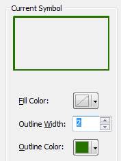
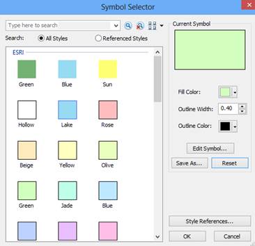
To change the appearance
of a map display, you can access the Symbology
menu just by double clicking on the Symbol
![]()
displayed in the ArcMap Layers, and you’ll get the Symbol Selector window

Click on the symbol
color box, make your selections for the Fill Color and the Outline
Color, and click OK, twice. You can show the outline of the State of Texas
more distinctly by using the No Color
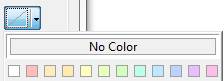
symbology for the Fill
Color and then changing the Outline Color to Green and the Outline Width
to 2.
Drag the Texas layer above the Counties layer, and you’ll see
that the Counties are not obscured as they were before and the State of Texas
is highlighted with a nice Green outline! We are green in Texas! If you have another color for your Counties,
then click on the Counties symbol in the Legend and in the Symbol Selector window that appears select a nice green color and
hit Ok to recolor your counties.
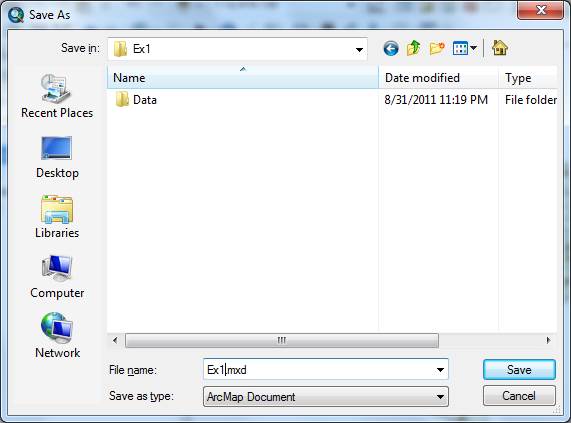
To Save this map
display, use File/Save As in ArcMap
and save the resulting file as Ex1.mxd.
Save your work in ArcMap
by choosing File/Save and, after navigating to your working directory,
naming the file Ex1 (the file will be assigned the extension mxd). When
you do this, the Ex1.mxd file contains
the file location of the geodatabase and the symbology you’ve chosen for
the map display. You can shut down Arc Map and then invoke Arc Map again and
reload the same map display by clicking on Ex1.mxd.
Note, however, that if in the mean time you’ve relocated your data,
ArcMap will go back to where you had it at the time the map file was saved.
________________________________________________________________________
Helpful Tip:
If you open your ArcMap
Ex1.mxd file later from another location in your file system, you may see a red
exclamation points beside your feature classes. If this happens, in ArcMap,
right click on the feature class use Data/RepairData Sources to relocate
the file location where the corresponding data are now stored and your map will
display correctly again.
2.
Viewing Shapefiles in ArcCatalog
Open ArcCatalog by clicking on the Catalog
tab on the right hand side of the map display
Click on the
“Folder Connections” button and navigate to where your data are
stored.
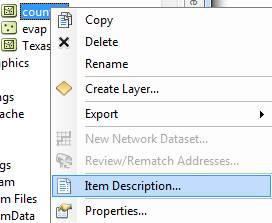
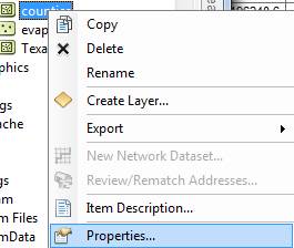
If you right click on a
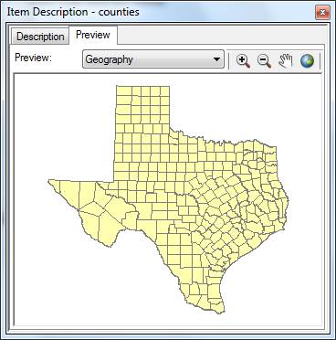
data layer, you can obtain an Item Description
Select the Preview tab and then Geography to see a map of the feature
class
And then select the Table view

The attributes FID,
Shape, Area and Perimeter are standard attributes for ArcGIS feature classes. The
units of the area and perimeter are defined from the map units of the feature
class.
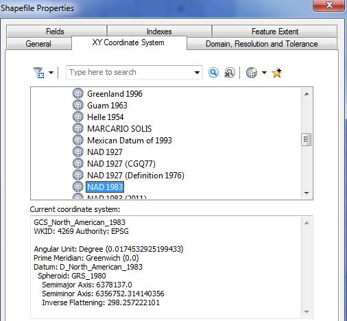
If you right click on a
feature class and then select Properties
And select XY Coordinate System which shows you
the parameters of the coordinate system of these data, NAD83, or the North American Datum of 1983. This provides a rather complicated set of
parameters that we’ll learn more about later.
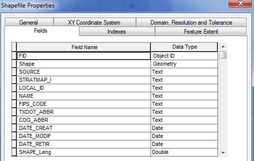
If you click on the Fields tab, you’ll see a formal
definition of each attribute field with its Field Name and Data Type.
In this case, ObjectID means a
special data type that indexes each feature as an object in the GIS, Geometry means that the Shape field has
geographical coordinates stored in it, and Float
and Double mean decimal numbers in
single or double precision, respectively. There are some other data types such
as Short and Long integers, Text and Date types, that we’ll encounter
later in the course.
Click on the other two
data layers, Evap and Texas to preview them also.
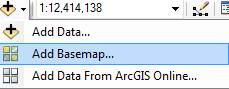
3. Using Base Maps from ArcGIS Online
Up to this point we have
just used local GIS data in our display. Let’s instead using base maps
from the ArcGIS Online. Use Add Basemap:
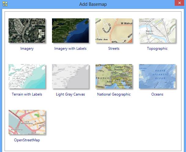
Click on “Streets”, in the bottom row of
maps. You’ll see a background map appear behind your Texas display. Pretty
cool!
If you get a message
asking about Hardware Acceleration, say Yes
to it.

You should see a result
like that shown below. If your BaseMap does not show up, use the Refresh tool ![]() in the bottom left hand corner of the ArcMap
display
in the bottom left hand corner of the ArcMap
display![]() to redraw the map and the
BaseMap should then show up.
to redraw the map and the
BaseMap should then show up.
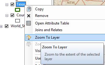
To quickly get the map
to center on Texas, right click on the Texas layer and select Zoom to Layer

Click on the Counties
theme and use the Symbol Selector to change the Fill Color to “No Color”
so we can see through it to the background map, and the new display appears. Let’s
examine Travis County.

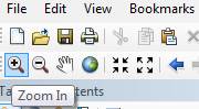
Use the Zoom in button to select a box around Travis County
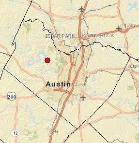
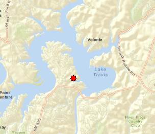
Zoom in to Travis County
by Austin in the center of Texas, and let’s examine the evaporation site
by Lake Travis to the Northwest of the city. Notice how more interesting
information appears as you zoom in closer.
Let’s label the
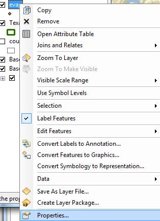
sites with their names. Right click on the Evap
theme and select Properties at the
bottom of the display that appears.
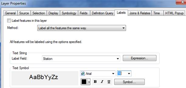
Labels tab and for the Label Field, select Station, and 16 point as the type size. Hit Apply
and then Ok, to close this window.
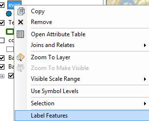
Now, right click on the
Evap theme again and select Label
Features, and you’ll see a nice label Mansfield Dam appear by the site next to Lake Travis.
Click on the symbol for
the Evap points and use the Symbol Selector to change the size of the points to
8 and the color to Red. Now we’ve got a nice map that shows the location
of our observation site labeled with its name.
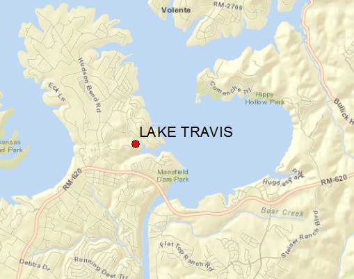
If you zoom in a bit
closer, you can see just where the site is located near Lake Travis. Mansfield
Dam is the dam that is at the downstream end of Lake Travis. You can even see
the access roads you’d use to go to this site.
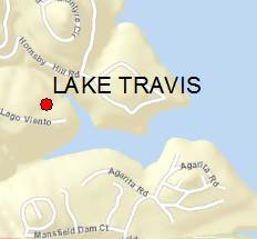
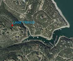
Now, let’s look at
some imagery for this location. Proceeding as you did before to get the Street map,
use Add BaseMap, to add data for Imagery Turn off the Street Map so you
can see the imagery.
And now you’ll see
the same information displayed against a background map of orthoimagery, and
let’s zoom in a bit to see more detail. For the Evap theme, I have used the Properties/Label
to change the color of my site labels from black to blue to make them easier to
see against the image background. This is really cool stuff! You can really get a sense of context about
where this observation site is located.
Use File/Save As to save this new map display as Ex1.mxd so that you can get it back later if you need it.
4. Accessing and
Querying Attribute Data
Let’s
go back to the view we had earlier of Travis County. Use the Go Back to
Previous Extent arrow
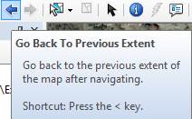
to step
back through the views we have just been working on, and turn off the Image basemap so that you can see the Streets basemap again. Change the Label
color for the evap sites back to Black.
Numerical
and text information stored in the fields of the geodatabase tables are called attributes.
To access attribute data of the feature classes at a specific location:
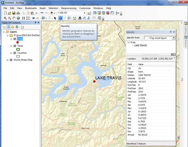
Click on
the Identify tool

Highlight the feature
class you are interested in the Table of Contents (Evap), and then click on the
feature on the map you are interested in. In the Identify window that
pops up you’ll see the attributes of that particular feature. In this
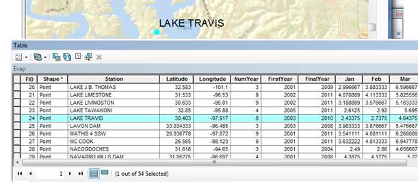
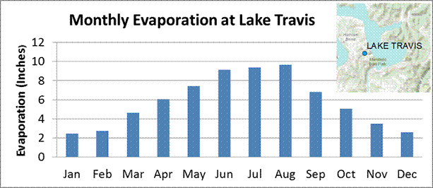
instance, what you see is that the data for Lake, cover the range from 2003 to
2010, the latitude and longitude are 30.403 and -97.917, and the values from Jan
through Dec are the mean monthly evaporation recorded at this location, in
inches, whose annual total is an Annual of 69.36 inches.
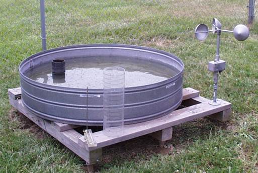
These are pan
evaporation data recorded using an instrument like that shown below. The
evaporation data were obtained from the Texas Water Development Board. Only
data from 2001 onwards is used since the TWDB has quality control checked that
information. Monthly evaporation is found by averaging the daily values of
evaporation read from the pan, and multiplying by the number of days in the
month. If a month has fewer than 20 daily values recorded, it is excluded from
the dataset. Only years with valid monthly data for all 12 months are used in
computing the mean monthly and mean annual pan evaporation data shown in the
attribute table.
Viewing
an Attribute Table
To access attribute data
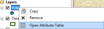
of an entire layer, in ArcMap: right
click on the Evap layer name in the
table of contents, and select Open
Attribute Table:
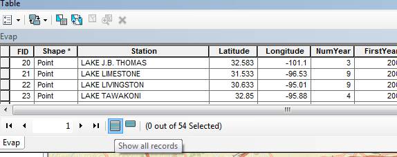
And if you scroll down the
resulting Table and click on FID 24 you’ll see the record that
contains the attributes of the Lake Travis station that you identified earlier.
Click on this to select it, and you’ll see the corresponding point
selected in the map – this is a key idea of GIS – map features are
described by records in attribute tables.
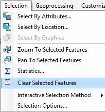
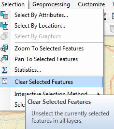
To Clear a Selected
feature and select a new one, use: Selection/Clear Selected Features in
the ArcMap toolbar:
5. Selecting features from a feature class
Selecting
features from a feature class involves choosing a subset of all the features in
the class for a specific purpose. Feature selection can be made from a map by
identifying the geometric shape or from an attribute table by identifying the
record. Regardless of how you select an object, both the shape in the map and
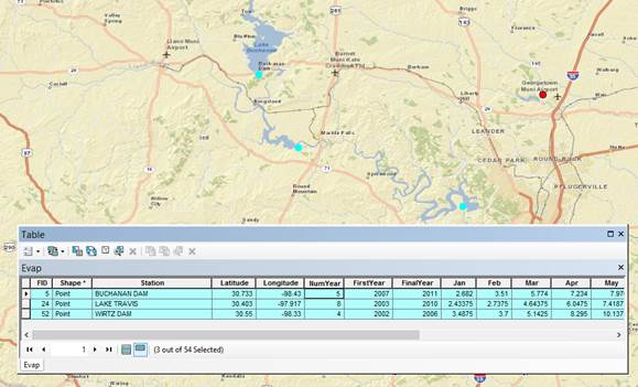
the record in the attribute table will be selected. Make sure that the Evap theme is highlighted in the Table
of Contents and then Click on the Select
Features by Rectangle tool

If
zoom back a little bit and drag a box over the three evaporation sites in the
Highland Lakes reservoir system,

you’ll
see both records highlighted on the map and in the attribute table. I’ve
turned off the Counties layer and used Show
selected records at the bottom of the Attribute Table to just show the
three highlighted stations.
To clear your selection,
choose Selection/Clear Selected Features.
Clicking on Show all records, then displays all the records in the
attribute table again.
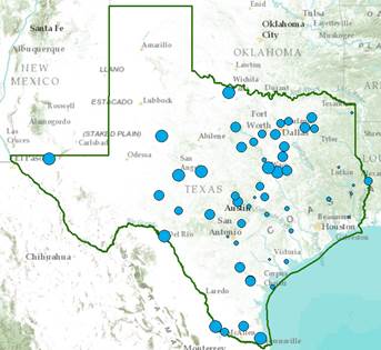
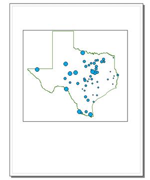
Let’s
suppose we want to map the values of annual evaporation recorded at the
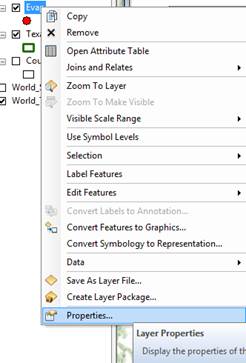
stations, rather than just symbolizing them by their location. Right click on
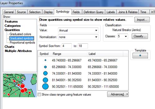
the Evap layer and select Properties/Symbology
Show Quantities/Graduated Symbols with the Value field of Annual, and make the Template
color blue.
I have
turned off all the other layers and added the Topographic base map to get the image below. Very cool!
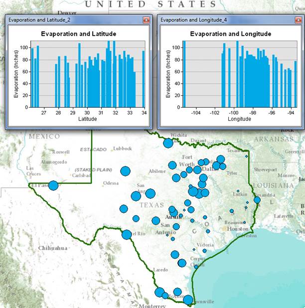
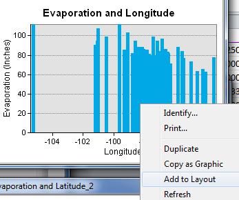
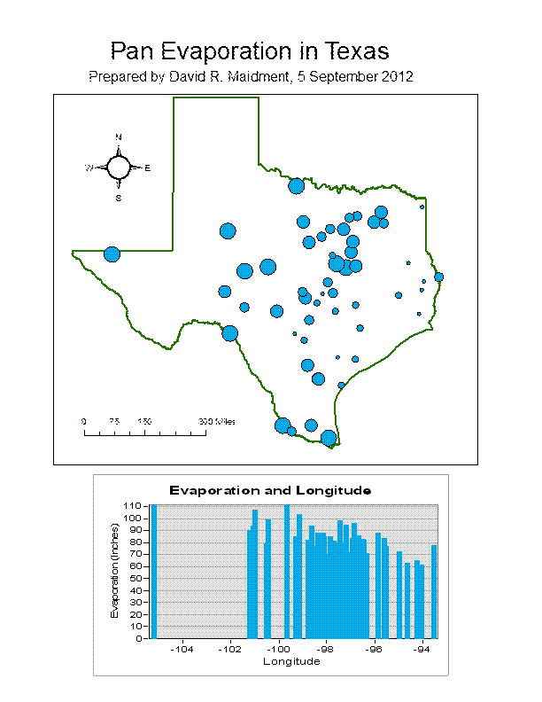
7. Making a Chart
You can see from the map
that there is some tendency for lower evaporation values near the coast and to
the East and higher values to the West. Charts are useful because they allow
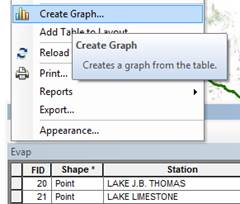
you to visualize trends in data. Click on Table
Options

at the top left of the
Table and select Create Graph.
You will be making a Vertical
bar chart (the default option). The next screen will allow you to indicate the
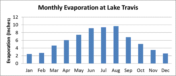
data to be used in the graph. Here is a graph of the Annual Evaporation (Annual) of all the stations plotted
against the Longitude of the station. You can see that there is a general trend
of the evaporation increasing as you go from East to West in Texas. The color
of the chart bars is blue, the same as the map points.
Click off “Add to
Legend” to get rid of the legend on the right hand side.
Hit Next and edit the graph properties to make them nicer. Add a title Evaporation and Longitude and relabel
the vertical axis Evaporation (Inches)

Click Finish, and you’ve created a
graph linked to mapped features in ArcMap.
If you create the same kind of graph for Evaporation and Latitude, you
can see that there isn’t a tendency for evaporation to vary with latitude
in Texas, as there is for variation of evaporation with longitude.
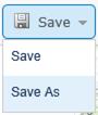
Save
your ArcMap document Ex1.mxd so that
you can retain this display.
Graphing in Excel
Another graphing
option is to make a chart in Excel using the dBase tables given by the
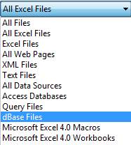
evaporation shapefile. Open the evaporation attributes table Evap.dbf as
a table in Excel. Use Files of
Type: dBase files in Excel to focus only on .dbf tables when you open the
table.
When you
open the file, you’ll see that the Station name is very wide (254
characters). Right click on this column
in Excel and select Column width of 30 characters to correct this.
Select the stations you want to plot, copy
their records to a new worksheet, delete the columns you don't need there, and
then create a chart. Here is an example chart created this way.
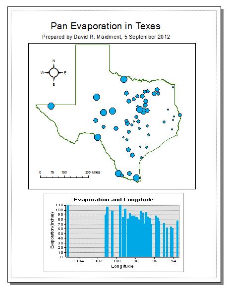
8. Creating a Map Layout
Now we
are going to create a formal map of evaporation in Texas that includes the
charts that we’ve created.
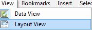
Change
the format of the display window from Data View to Layout View by
clicking on View/Layout View,
If
nothing shows up in your layout, hit Focus
Data Frame to put your map in the Layout Window.
 .
.
Reduce the size of the
data frame in the layout (i.e., rectangle where the spatial data is contained)
-- to make room for the graph -- by clicking on the map and moving its
handlers. If you have a zoomed in view in Arc Map, you’ll get the same
image in in the Layout. To move the location of your map, go back to the Data View and use the Pan tool

to move your map around. When you switch back to the Layout View the new map
location will be displayed.
I have turned off the
Basemap to make the map easier to interpret.
Keep saving your ArcMap
document as you proceed through the map making steps so that if you mess up
something you can get back the work you’ve already done.
To insert the ArcMap
Chart into the Layout, right-click on the upper blue bar at the top of the
Chart and select Add to Layout. Move and resize the graph as necessary. If
you want to copy your graph from Excel, highlight the graph, and click on Copy in Excel, then Paste in ArcMap and your graph should
appear in the map layout.
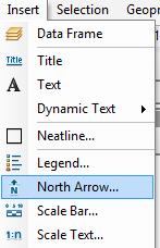
You can also insert a North Arrow and a Scale Bar by using the Insert
menu in ArcMap.
When you put up the
scale bar you can select the distance units to be displayed. I have used miles.
You can add a Title or Text with the text tool ![]() shown next to the line draw tool.
The text displays in very small font sizes.
Select and click on them, and use Properties
to resize them.
shown next to the line draw tool.
The text displays in very small font sizes.
Select and click on them, and use Properties
to resize them.
Your map might look like
this:
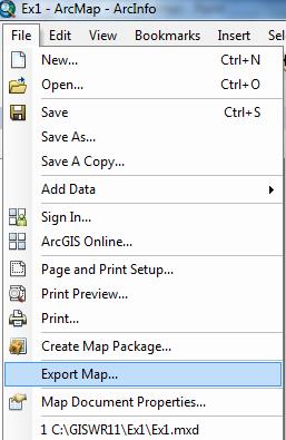
You can export your map
from ArcGIS using File/Export Map
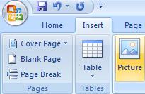
from the ArcMap menu, and you can store this as Ex1.emf in your data file. Then you can add it to a Word document
using Insert/Picture/From File and
load this emf file, as shown below. Pretty cool!
Then you can add it to a
Word document using Insert/Picture/From
File and load this emf file, as shown below. Pretty cool!
Helpful Tip:
A more general procedure
is to simply copy the screen to the clipboard and crop out the part that you
want, saving it to a file for later use. That is how all the images in this
exercise were prepared. To copy any image, use the Snipping Tool in All Programs/Accessories on your
Windows Desktop interface
Drag the cursor around the area that you want to capture and
you’ll see it copied into a new display, then use Paste
to insert this snippet into a specific location in your document. If you only
want to capture the active frame, press Alt
+ Print Screen and then Paste it to the new document.
This approach can also
be used to add a map to a chart in Excel:
The manipulations just
described transfer objects from one application to another.
To
be turned in: An ArcMap map layout in it showing a map of Texas with gages, coupled
with a graph showing monthly evaporation data plotted from the gages. In the
presentation of information on maps and charts it is important to include
sufficient labeling detail so that the information can be clearly and
unambiguously interpreted. You should include a scale bar to indicate distance,
a north arrow to indicate direction and labels or legends with units wherever
they are needed to interpret map or quantitative values.
Now, let’s suppose
that you don’t have ArcGIS Desktop and you want to make a map anyway. Let’s
do this in ArcGIS Online. You can make a map in ArcGIS Online without an ESRI
Global Account, but if you want to save the map and share it with others on the
web, you have to have an ESRI Global Account to do that. If you don’t
have and ESRI Global Account, go to https://webaccounts.esri.com/cas/index.cfm
and create an account. For “Organization” use “University of
Texas at Austin” or “Utah State University”, whichever is
more appropriate for you. To execute this part of the exercise you need to have
two files:
(1) A Comma Separated Variable (CSV) file of Texas Pan Evaporation: http://www.caee.utexas.edu/prof/maidment/giswr2013/Ex1/AGOL/TexasPanEvap.csv
(2) A zipped shape file of Texas Counties: http://www.caee.utexas.edu/prof/maidment/giswr2013/Ex1/AGOL/Counties.zip
Go to http://www.arcgis.com and sign in with your ArcGIS Online Username and Password
Click on ![]() to bring up a Topographic Map of the United
States to which we’ll add the pan evaporation data. I have created a New
Folder called GISWR2013 to store information in from this class and to keep
this separate from what I have done in ArcGIS Online for other purposes.
to bring up a Topographic Map of the United
States to which we’ll add the pan evaporation data. I have created a New
Folder called GISWR2013 to store information in from this class and to keep
this separate from what I have done in ArcGIS Online for other purposes.
A topographic map of North America opens up. Zoom in to Texas. You can press “Shift” and then use your mouse to drag a box across Texas to facilitate zooming in.
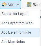
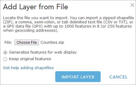
10. Adding Pan
Evaporation Data
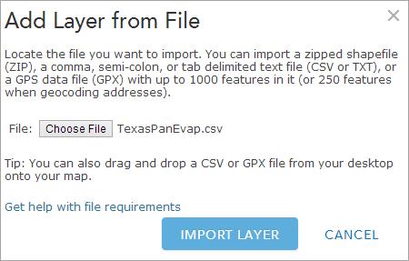
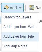
Add a Layer from File
Choose TexasPanEvap.csv and click Import Layer
You’ll see the points added to the map. This happens because the .csv file has the Latitude and Longitude of the points in decimal degrees:

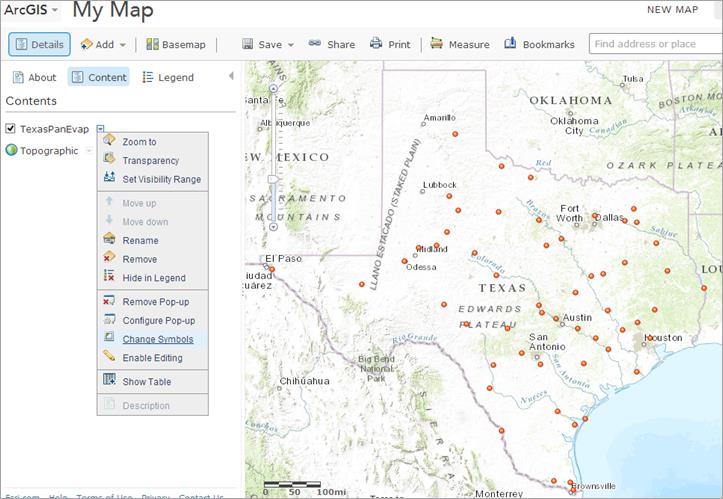
Now, let’s Change Symbols on the map.
Use Size as the discriminator and Annual as the Attribute to show. This value is the annual pan evaporation in Inches.
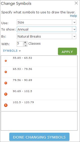
Hit Apply and Done Changing Symbols and you’ll see a new map, and if you click on one of the observation sites, you can see the data values at that point.
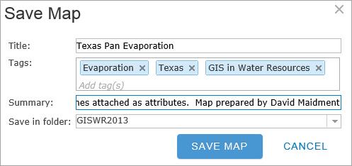
Ok, this is pretty cool. You’ve just created a web map with your own data in it. Now, let’s save the map into your ArcGIS Online workspace:
I have given my map a title, some tags by which it can be discovered and a description.
Now if you look in Home/My Content,
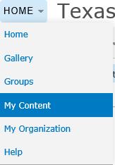
You’ll see that you have the new map stored there.
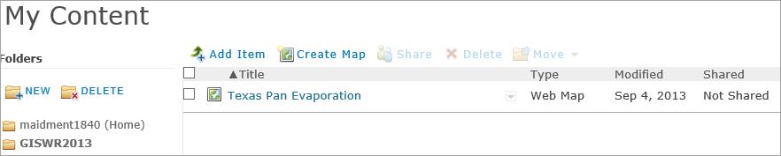
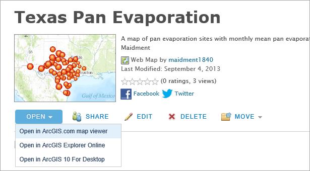
If you click on the Texas Pan Evaporation map title, you’ll see a window open that tells you about this map, and if you open this in the ArcGIS.com map viewer, you’ll see your map again as you had it before. Hence, if you inadvertently close your web browser wherein you are creating this map, nothing is lost.
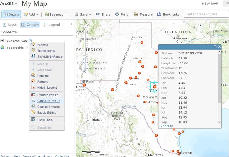
Let’s Configure the Pop-Up that it shows just selected attributes, and also a chart of monthly pan evaporation. Hit Configure Attributes.
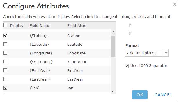
Select Station and all the monthly and annual evaporation values. Hit Save Pop-up. Now, your map will show a reduced set of attributes when you click on a point.
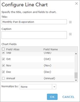
Now, Configure the Pop-Up again, and let’s add a Line Chart
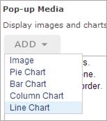
Make the title “Monthly Pan Evaporation” and select all the monthly
pan evaporation values to display. Click Ok
to apply these choices. And Save Pop-Up
to get the new chart in the Pop-Up display.
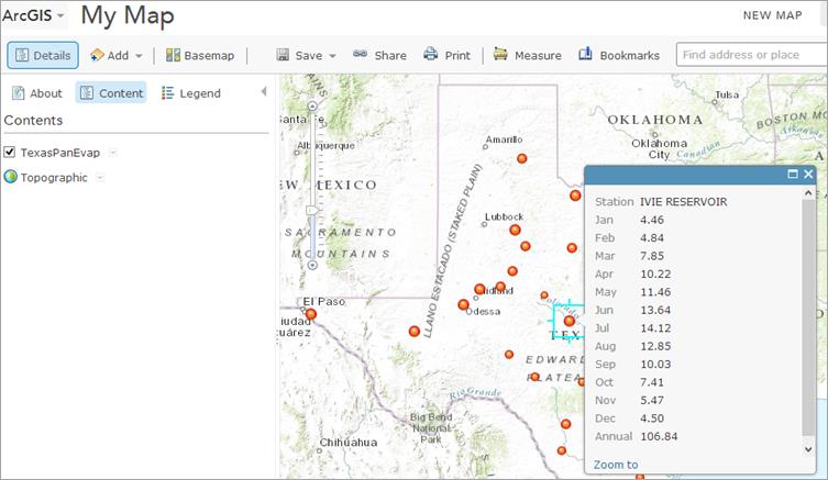
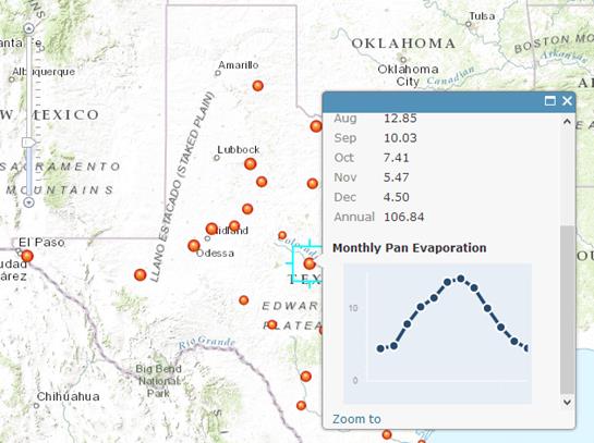
And now when you click
on a point you get rather a nice chart, which along with the annual value of
pan evaporation tells you the total evaporation and gives an image of how it is
distributed over the year.
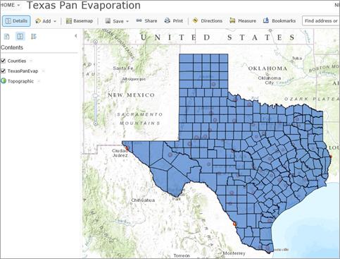
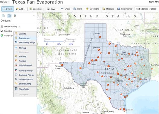
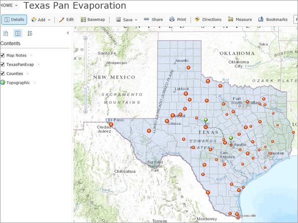
12. Adding Counties and Map Notes
Now, let’s add the
Counties layer to provide some more
spatial context for the observation points
We’ll add the
Counties as a zipped file of the Counties shape file.
When the Counties layer
displays, it is the first layer on top of the map and it obscures the pan
evaporation points.
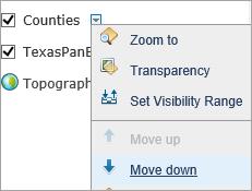
The Counties layer can be moved
down so that the points are more clearly displayed
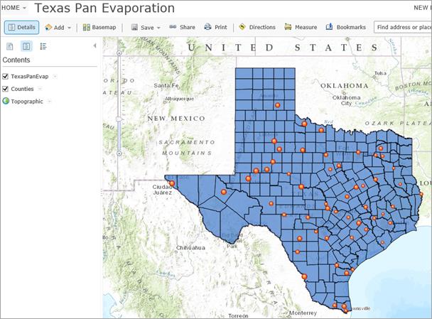
And if you set the
Transparency of the Counties layer to 75%, a rather pleasant map appears:
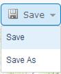
Let’s Save the map so we can retrieve it in
this condition again.
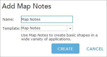
Now, let’s suppose
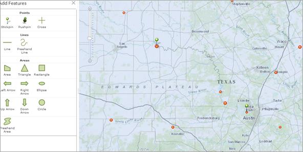
we want to Add some Notes on this map.
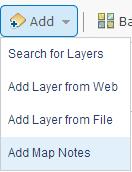
Just accept the template
as it is presented to you using Create
Add Stickpins to highlight the Pan Evaporation Sites at Lake Travis and
Lake Ivie, both important water supply lakes on the Colorado River in Texas.
13. Sharing your Map on the Web
Now let’s suppose
you want to Share this map with
colleagues online.
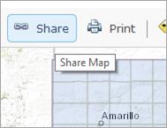
I am a member of a
number of Groups in ArcGIS Online,
and I could choose just to share my map with one or more of those, but instead,
let’s share the map to Everyone
(public), and that way anyone can see it. I get back a web link for this http://bit.ly/17zT5BM
And if I put this
address into a web browser, my map appears again! Ok, this is pretty cool. I’ve
created a map on the web and shared it with others.
Two things to
check:
(1) Make sure that you have saved your
map zoomed out so that a user can see all of Texas in it, rather than
zoomed in to some location.
(2) Make sure that you have used “Share” to
make your map accessible at least to the UT Austin Organization if not Publicly
so that I can view it and grade it.
Otherwise, I won’t be able to see it.
To
be turned in: The web link (equivalent to my http://bit.ly/17zT5BM) for your map
so that I can view it online.
___________________________________________________________________________
Summary
of Items to be Turned In:
(1) An ArcMap map layout in it
showing a map of Texas with gages, coupled with a graph showing evaporation
data plotted from the gages. In the presentation of information on maps and
charts it is important to include sufficient labeling detail so that the
information can be clearly and unambiguously interpreted. You should include a
scale bar to indicate distance, a north arrow to indicate direction and labels
or legends with units wherever they are needed to interpret map or quantitative
values. Let’s see some nice cartography!!
(2)
The web link (equivalent to http://bit.ly/17zT5BM) for your map so that I can
view it online.
The
assignment is due in a week from the date it was assigned in class. Please save
your solution as a .pdf file and email it to me ( maidment@mail.utexas.edu
).