FAO/UNESCO Water Balance of Africa
Exercise 1: Introduction to ArcView in West Africa
Prepared by
David R. Maidment and Seann M. Reed
Center for Research in Water Resources
University of Texas at Austin
November 1996
Table of Contents
Brief Overview of ArcView
ArcView is a software program, developed by Environmental
Systems Research Institute (ESRI), which is used to do GIS analysis.
It differs from Arc/Info in that Arc/Info is designed to develop GIS data
while Arcview is designed to interact with GIS data which has already been
created.
All activities within Arcview are organized with a Project, which
may consist of a number of Views, Tables, Charts, Layouts,and Scripts.
Scripts are programs in the Avenue language (the programming language of
ArcView) and while this exercises uses Scripts which are intrinsic to Arcview,
the exercise does not include user-defined scripts. The functions of Arcview
include: displaying coverages in a View, viewing the related attribute
tables of this View, relating attribute tables through a key item, plotting
Charts to display spatial information, and creating Layouts to present
information provided by Views, Charts, and Tables.
Goals of the Exercise
-
To serve as an introduction to Arcview
-
To give you experience in working with Views, Tables, Charts, and Layouts
in Arcview
-
To produce a Layout which shows a map and connected Charts of data measured
at locations on the map.
Computer and Data Requirements
This exercise requires Arcview, Version 2.0 or higher. It can be executed
on a PC or on a workstation. The data needed for this exercise have already
been loaded onto the PC's you will be using, and may be found under the
directory \exercise\ex1\gisfiles . The coverages that you will need
for this exercise are:
-
A polygon coverage of African countries, called afrbord.shp.
-
A polygon coverage of climate data covering West Africa, called wafrclim.shp.
-
A point coverage of cities in Africa called afrcity.shp
-
A point coverage of Moroccan cities called marcity.shp
Internet students can download the necessary files.
Site: ftp.crwr.utexas.edu
Login: anonymous
Password: your e-mail address
Directory: /pub/outgoing/crwr/gishydro/africa/ex1
File(s):
-
afrbord.shp, .shx, .dbf
-
afrcity.shp, .shx, .dbf, .sbn, .sbx
-
marcity.shp, .shx, .dbf
-
maroc1.shp, .shx, .dbf
-
wafrclim.shp, .shx, .dbf
-
morocco.shp, .shx, .dbf
-
prec.avl
-
wafrclim.shp, .shx, .dbf
Instructions
on how to use anonymous ftp.
Procedure
Please Note: The following procedure is a general outline which can
be followed to complete this lesson. However, the user is encouraged to
experiment with the program and be creative.
1. Start Arcview
Execute ArcView on your machine. On PC's this can be done by clicking on
this Icon in the Program Manager Window 
Help! If at any time in the exercise you are lost and don't know
how to do something, ArcView has on-line help which is accessed by hitting
the  symbol
in the top right corner of the display window, then click on the button
for which you need help and a help screen will appear.
symbol
in the top right corner of the display window, then click on the button
for which you need help and a help screen will appear.
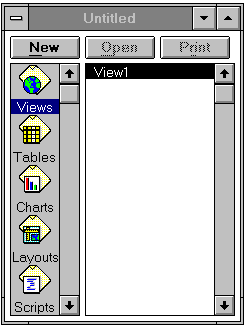
When ArcView is first executed, a new untitled Project window is opened.
This window includes several icons marked Views, Tables, Charts, Layouts,
and Scripts. This is the main Project window, which allows you to
create new Views, Charts, etc., or to open existing ones that you have
already created in that project.
2. Display Themes in a View
Make sure that the View icon is highlighted in the Project window and click
on New for a new View. Drag the View window out of the way and resize
it if necessary. Add a new theme to the View by clicking on the  button on the top tool bar. Go to the directory \gisfiles\ex1af by typing
the directory name into the pathname box or by double-clicking on this
directory with the mouse. Highlight the two coverages shown: afrbord.shp
and wafrclim.shp (hold the Shift key while selecting the
second coverage), and click on OK to add them to your View. They
will each show up as a bar in the legend portion of the View window with
the name of the coverage shown on it. For the View you are working with,
the coverages afrbord.shp and wafrclim.shp are called Themes.
Click on the raised box to the left of the Theme names "wafrclim.shp" and
"afrbord.shp" to make a check mark and see the coverages displayed in the
View window. The Legends for these Themes can be modified as described
below.
button on the top tool bar. Go to the directory \gisfiles\ex1af by typing
the directory name into the pathname box or by double-clicking on this
directory with the mouse. Highlight the two coverages shown: afrbord.shp
and wafrclim.shp (hold the Shift key while selecting the
second coverage), and click on OK to add them to your View. They
will each show up as a bar in the legend portion of the View window with
the name of the coverage shown on it. For the View you are working with,
the coverages afrbord.shp and wafrclim.shp are called Themes.
Click on the raised box to the left of the Theme names "wafrclim.shp" and
"afrbord.shp" to make a check mark and see the coverages displayed in the
View window. The Legends for these Themes can be modified as described
below.
Save the Project
Once you've got your Project set up, you can save it to a file by making
the Project window active and choosing the menu option File / Save Project.
The Project file that you save has the extension ".apr" and contains information
about the structure of your project, including the pathnames to the data
dislayed in it. The Project file is an ASCII file that can be viewed with
a text editor if you are curious about what it looks like. It is wise to
periodically save the Project as you carry out this exercise so that you
can recover all your work in the event that you crash Arcview before completing
the exercise.
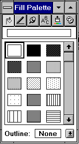
3. Adjust the Display of the Themes
The legend for a Theme can be adjusted by double-clicking on that Theme's
name. This brings up the Legend editor.
Double-click on the "wafrclim.shp" Theme to edit its legend. We want
to only show the mean annual precipitation map for West Africa. In the
legend editor, next to Field use the scroll bar to select the field
pann. You will see a ramped display of 5 shades under Symbol.
Double-click on the lowest box (highest precipitation) and open the Fill
Pallette. Select the Paintbrush symbol and select a color for this box.
Hit Ramp to shade colors from lowest to highest precipitation. To
apply this legend change to the View window, click the Apply button
in the legend editor.
To display the country borders on top of the climate data, drag the
legend bar for wafrclim.shp below the legend bar for afrbord.shp. Dragging
a Theme is accomplished by clicking on the Theme name, holding down the
mouse, and dragging the box that appears.
Activate the Legend Editor for the coverage wafrclim.shp, select the
field "pann" as the field for which the legend will be edited. This field
contains estimates of mean annual precipitation. Load a pre-defined ArcView
legend file by clicking the Load button in the Legend Editor. In
the Load Legend box, select "prec.avl" and click OK. Click the Apply
button in the Legend Editor to update the View window. The units in
the legend are mm/year.
You can pan or drag the display area of a map by using the pan tool  .
You can zoom in or zoom out from a portion of the View window using
.
You can zoom in or zoom out from a portion of the View window using  or
or  . To zoom to the extent
of active Themes, use the
. To zoom to the extent
of active Themes, use the  tool in the upper row of the tool bar. A Theme is active if its legend
bar in the View window appears raised. In preparation for the next section,
zoom to the extent of Morocco.
tool in the upper row of the tool bar. A Theme is active if its legend
bar in the View window appears raised. In preparation for the next section,
zoom to the extent of Morocco.
4. Open a Table
To View tabular information associated with a Theme, first activate the
Theme of interest by clicking on the Theme name in the legend bar of the
View window, then click on  in the top row of buttons to open the Table. By clicking on a row in a
Table you can highlight that row and the corresponding feature (climate
data polygon) in the map. Notice how there is a one to one correspondance
between a record in the data table and a geographic feature in the map.
This table-map linkage is one of the key things that makes a GIS operate
effectively. To make sure that the row you've selected is easy to see,
promote to the top of the table using the
in the top row of buttons to open the Table. By clicking on a row in a
Table you can highlight that row and the corresponding feature (climate
data polygon) in the map. Notice how there is a one to one correspondance
between a record in the data table and a geographic feature in the map.
This table-map linkage is one of the key things that makes a GIS operate
effectively. To make sure that the row you've selected is easy to see,
promote to the top of the table using the  icon.
icon.
Selecting Particular Features in the Map
Use the scroll bar at the bottom of the table to move through the fields
of the table until you see X_coord and Y_coord. These are the (x,y) or
(longitude, latitude) coordinates of the center of the cell in decimal
degrees. For locations within Morocco, longitude is negative because Morocco
is located West of the Prime Meridian through Greenwich, England.
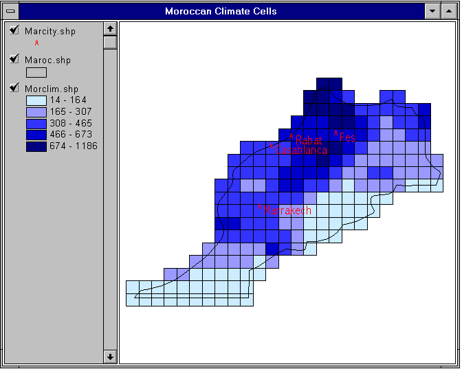
The locations of some Moroccan cities are approximately:
Rabat: (-6.8, 33.9)
Casablanca (-7.5, 33.5)
Marrakech (-8.0, 31.2)
Fes (-6.5, 40.0)
You can see where these cities are located by adding the theme afrcity.shp
to the View. This file is stored in \gisfiles\ex1af. To display just the
cities in Morocco, add the theme marcity.shp to the View. To label
the cities with their names, choose, Theme/Properties/Text Labels
and choose Name as the label item. Then choose Theme/Auto-label
to add the names to the points in the map. Use Window/Select Tool Palette
and the Paintbrush Icon to recolor the Text.
By holding down the shift key, you can highlight several features at
once. By clicking on the View window and then using the box selection tool  ,
you can select features from the map and see the corresponding records
highlighted on the Table. By clicking on
,
you can select features from the map and see the corresponding records
highlighted on the Table. By clicking on  you can unselect all records.
Lets find the climate boxes that overlay Morocco. First, we will create
a coverage just of Morocco. Highlight the afrbord.shp theme in the View
window. Click on the button
on the View toolbar, then click on Morocco in the View. It will be highlighted
in yellow. Under Theme, Use Convert to Shapefile to make
a new theme of Morocco alone and save it in \gisfiles\ex1af\ as Maroc.shp.
Add the new theme to the view and you'll see the outline of Morocco. Use
the Legend Editor, click on the symbol box, and select Fill blank to show
just the outline of Morocco.
To select those climate boxes overlying Morocco, highlight the Wafrclim.shp
theme in the View, then go to Theme/Select by Theme and use Intersect
with the selected features of Maroc.shp. You'll see the climate
boxes highlighted over Morocco. Use Theme/Convert to Shapefile to
make a new shapefile of the selected climate boxes, store it as Morclim.shp
in \gisfiles\ex1af and add it to the View. Open the table for the Morclim
theme and notice how a new table has been created with just the data in
it for the climate boxes for Morocco. If you have trouble doing this operation,
you can get copies of the files from \gisfiles\ex1af as maroc1.shp and
morclim1.shp.
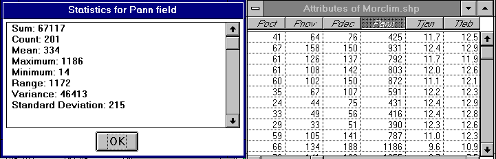
Selecting Particular Fields in the Table
In the Table associated with wafrclim.shp, there are many data fields.
You can see all of these fields by scrolling to the right using the scroll
bar at the bottom of the Table. The data attached to this polygon coverage
include monthly average values for precipitation "P" (mm), temperature
"T" (deg C), "Swd_" downward shortwave radiation (W/m2), and net radiation
"Nr_" (W/m2). For example, the field named "Pjan" contains estimated precipitation
for January, the field named "Tjan" contains the average temperature in
January, the field "Swd_jan" contains a downward shortwave radiation estimate
for January, and the field "Nr_jan" contains a net radiation estimate for
January. The precipitation and temperature data used here come from the
Legates-Willmott global climatology, and the radiation data from the NASA
Earth Radiation Budget Experiment (ERBE).
By clicking the  icon in the View tool bar and then clicking on a map feature in the View
you can find out information about any feature in the active Theme (a display
of its record in the data table). If you click on a feature and don't see
the correct record displayed, check to see that the correct theme is highlighted
in the View window legend bar.
icon in the View tool bar and then clicking on a map feature in the View
you can find out information about any feature in the active Theme (a display
of its record in the data table). If you click on a feature and don't see
the correct record displayed, check to see that the correct theme is highlighted
in the View window legend bar.
You can determine summary statistics for a particular field selecting
that field by depressing its header label and then selecting Table/Statistics.
For example, here is the summary statistics table for the mean annual precipitation
climate cells over Morocco which indicates that the precipitation in these
cells ranges from 14 mm/yr to 1186 mm/yr with a mean value of 334 mm/yr.
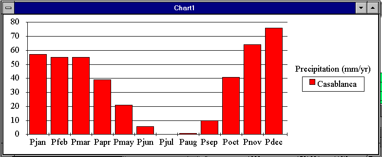
5. Make a Chart
With the climate Table open, select one record for which you wish to make
a time-series plot. For example, you can click on the record having Afpoly_
= 1990 and that is the cell containing Casablanca. Select Table/Chart
in the Table window to get the Chart Properties dialogue box. For this
exercise, we wish to plot the monthly precipitation, so select the fields
"pjan","pfeb". . . "pdec" from the list of fields on the left hand side
of the Chart Properties box. Again, multiple fields can be selected by
holding down the shift key. Once this is done, click on the box labeled
Add. After clicking OK, a Chart will be plotted. You can change
the form of the Chart using items in the top tool bar. The horizontal axis
of the Chart is automatically labeled using the field names you selected
for plotting. If these are too long to fit on the chart, you can make shorter
aliases for these field names by making the Table active, selecting the
menu item Table / Properties, and entering text into the column
labeled Alias. To Edit Features of the Chart, select the Chart Edit
tool  and then click on
the feature you wish to Edit. For example, by clicking on the Legend "Record
= 43", you can change this to "Casablanca" to reflect the location of this
data set.
and then click on
the feature you wish to Edit. For example, by clicking on the Legend "Record
= 43", you can change this to "Casablanca" to reflect the location of this
data set.
6. Make a Layout
A Layout allows a user to combine Views, Tables, Charts, Legends, and Text
into one document for printing. To create a new Layout, double-click on
the  icon in the Project
window. To work with a Layout, it is useful to enlarge the Layout window
(by dragging on the window corner(s) with the mouse). After enlarging the
window, click on the Zoom to page
icon in the Project
window. To work with a Layout, it is useful to enlarge the Layout window
(by dragging on the window corner(s) with the mouse). After enlarging the
window, click on the Zoom to page  tool to maximize use of the window space. As illustrated in the image below,
by clicking and holding the left mouse button on the furthest icon to the
right on the lower tool bar, you can add a number of different objects
to the Layout. From top to bottom, the objects that you can add are a View,
a Legend, a Scale, a North Arrow, a Chart, a Table, or a Picture. After
selecting one of these items, you can draw a box on the Layout to specify
the location and size of the selected object.
tool to maximize use of the window space. As illustrated in the image below,
by clicking and holding the left mouse button on the furthest icon to the
right on the lower tool bar, you can add a number of different objects
to the Layout. From top to bottom, the objects that you can add are a View,
a Legend, a Scale, a North Arrow, a Chart, a Table, or a Picture. After
selecting one of these items, you can draw a box on the Layout to specify
the location and size of the selected object. 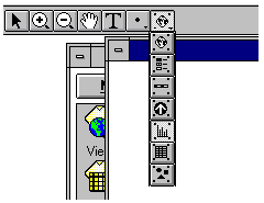
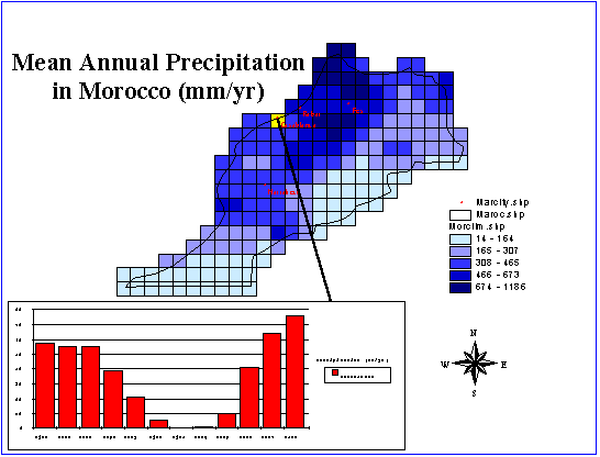
You can add text to a Layout using the  button. You can also draw points, lines, and polygons using
  .
If you find that the lines you are drawing are not in quite the right locations,
use Layout/Properties and click off the "Snap to Grid" box. To change
the size of the text you've added, highlight the text and use Window/Show
Symbol Palette and the text icon to alter the text size. Text size
of 14 point is the default. Usually 24 or 36 point looks good in layouts.
Similarly, to change the line thickness use the same pallete and select
the Line icon. Line thickness of 1 is the default. Here is an example of
a layout that can be created using these tools.
.
If you find that the lines you are drawing are not in quite the right locations,
use Layout/Properties and click off the "Snap to Grid" box. To change
the size of the text you've added, highlight the text and use Window/Show
Symbol Palette and the text icon to alter the text size. Text size
of 14 point is the default. Usually 24 or 36 point looks good in layouts.
Similarly, to change the line thickness use the same pallete and select
the Line icon. Line thickness of 1 is the default. Here is an example of
a layout that can be created using these tools.
7. Do Something Creative!!
Now that you are familiar with the operation of Arcview, make some new
maps, charts or tables of different variables in places that are of interest
to you. For example, you may wish to return to Casablanca and make charts
of the monthly temperature, short wave radiation and net radiation so that
you can see how the elements of the climate of Casablanca change seasonally.
Ok, you're done!
These materials may be used for study, research, and education, but
please credit the authors and the Center for Research in Water Resources,
The University of Texas at Austin. All commercial rights reserved. Copyright
1997 Center for Research in Water Resources.
Go Back to the Index
of the Exercises